The RATSNAKE is a wonderful event.
Held in memory of Dr. Ken Stalter, a man known for his grit. It is challenging. It is fun.
There is a trail run, and there is a 'backwards triathlon' which starts with the same run loop in the park, through the woods, over some intense scrambles and then out on to the beautiful country roads for cycling portion. There are challenging climbs and sweeping descents, all in a quiet little pocket of the world. And then, there is the comically short and shallow 'swim' which most people run/slosh around the buoy and out, while some of the more silly contestants have been known to dive head first into the sand.
Afterwards, there is a pig roast and a magnificent atmosphere of community, with jokes camping and an offering of craft beer so sought after I dare not mention it by name here.
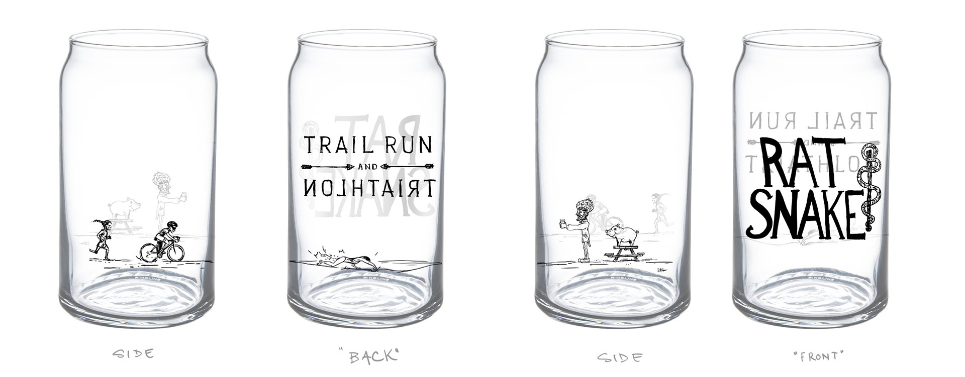
The race director was looking for supplemental graphics for a beer can shaped pint glass, for the finishing prize.
The logo of the RATSNAKE was done years ago. I've always admired the straight to the point hand drawn lettering. Its balance and being do well to communicate the vibe of the race. Simply marking the name, looking good, and not fussin' over nothin'.
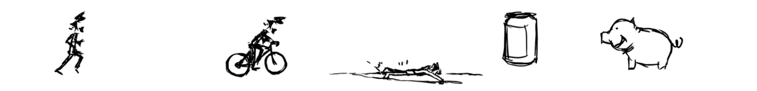
After seeing some of my illustrations on instagram, the RD was looking for some very simple stick type figures to represent the race.
A runner, biker, and somehow someone swimming in ridiculously shallow water, followed by a beer can and a pig. To illustrate the simple concept of just putting the icons in a linear order of race logo to runner to biker to swimmer to beer can to pig in black print to wrap around the glass.
A runner, biker, and somehow someone swimming in ridiculously shallow water, followed by a beer can and a pig. To illustrate the simple concept of just putting the icons in a linear order of race logo to runner to biker to swimmer to beer can to pig in black print to wrap around the glass.
A bonus, he mentioned, would be a Native American touch; that would represent part of Ken's heritage, something that he wrote a book about since he had family members flee the Cherry Valley massacre to western NY and a path he recreated as a personal ultra run.
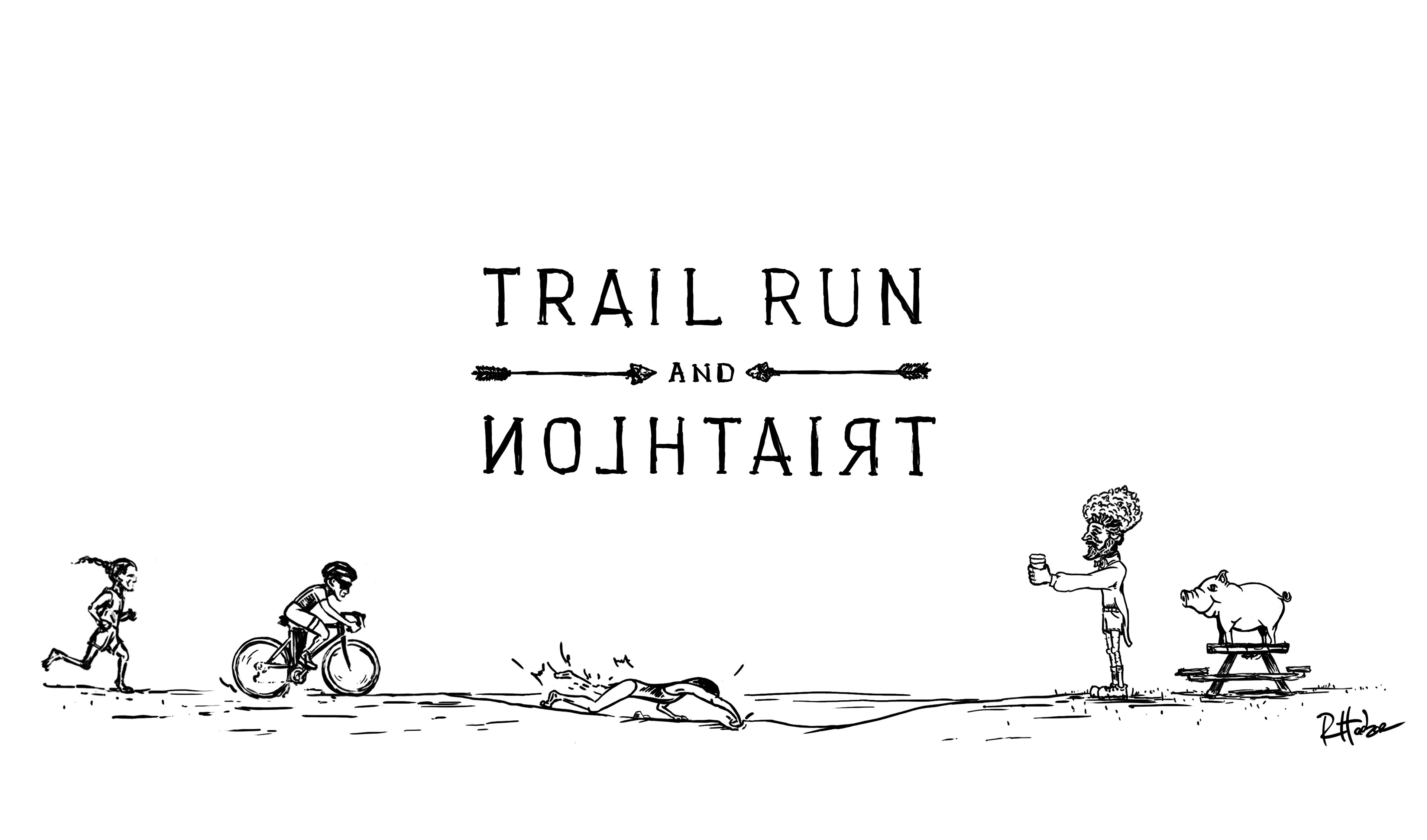
I had fun with this little commission. I've had the honor of racing this beast in the past... and it was a joy! The concept was solid and I brought in a little more detail to the illustration, to help hit a couple points of representation/symbolism.
- The braid and slight facial structure of the runner hopes to give a very subtle nod to native roots, without overdoing it.
- Attempted to keep vague androgyny on the runner and cyclist.
- A lady swimmer, crashing and splashing into the water and its shallow floor.
- A can icon started to seem too simple to match the scene; so, the gentleman with the knobby knees and coattails emerged, waiting, along with the little pig. Alluding to the feast and libations waiting to reward the competitors for their accomplishment.
- The word TRIATHLON is to be printed backward so when drinking from the RS logo side it would read forward.. a silly and small way to play on the unique nature of the backwards triathlon event.
This years event is sold out.
If you are looking for a challenge, keep your eyes peeled for 2018.
If you are looking for a challenge, keep your eyes peeled for 2018.